Get Started
Create fast and responsive sites with Forge Grid
Use the Grid system and pre-built components and bring projects to life with Qwik Download the library through code (npm). Go directly to the CDN, install via Package Manager
Qwik Grid Installation
www.npmjs.com/package/qwik-grid-fm

How to implement Row and Col in your project!!
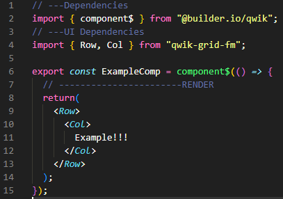
Grid system concept

A simpler and faster way to accommodate information within the layout area, so we set the area in percentage (100%) similar to the 24-section layout area of Ant design or the 12 colums of bootstrap, you can think it as a 100 col system. To ensure a high level of visual comfort. Here is a brief look at how it works:
👉 Set a set of columns in the horizontal space defined by row (abbreviated Col).
👉 Your content elements should be placed directly on Col and only Col should be placed directly on the 'Row' container.
👉 The grid column system has a percentage value of 100% to represent range sections. for example, you can create 4 columns of equal width with ﹤Col span= ﹛25﹜/﹥
👉 If the sum of the Cols in one of the rows is greater than 100, then the Col will be moved to another column. Everything will start a new arrangement of lines.
Basic Usage
You can create a basic Grid system by using a unique set of Row and Col assemblies, all columns (Col) must be placed in a row (Row). For example:
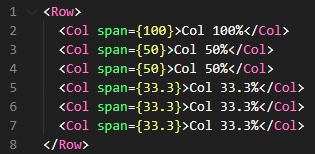
Responsive
You can set it to a responsive behavior to have different widths depending on the breakpoints (xs < 576px, sm < 768px, md < 992px, lg < 1200px, xl < 1600px, xxl >= 1600px ). For example:

Debug
Debug is a useful property when you want to dimension or design layout spaces 😊. It is used to identify the areas you are working on, without the need to use a background-color in CSS

Nested
A simple example of nesting a Grid inside another. Any Grid column can contain another Grid inside.
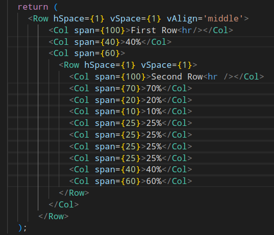
Aligns Elements
Top
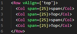
Middle
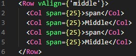
Bottom
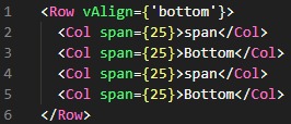
Elements aligned vertically, in Top, Middle, or Bottom position
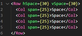
Space Elements
The Space Element property we can separate our containers with the properties (hSpace) and (vSpace) for example:
Massive Responsive
Massive Responsive with basic components for your website, a perfect option to create websites with many containers.
